I started my career as a design intern for a frozen yogurt chain. While it was a great first experience, I ended up performing the same tasks over and over again. Designing logos was my passion, so I challenged myself to design a logo every day for 365 days.
My perfectionist side wanted to create full logos and brands, but the realist side knew it would be hard to stay consistent for an entire year. To save time and keep my sanity I set the following rules:
- Focus on the concept by exclusively using black and white.
- Refine each logo by using grids.
- Limit the typefaces to the ones from Adobe Fonts.
- Spend a maximum of one hour on each post.
My favorite part of the one-hour timebox was refining and iterating until the logo felt and looked right. Gridding every day helped me develop a system that I still use today. This is a step-by-step guide to refining logos.
But First, Something About Logo Grids
- Grids are not necessary. Good designers have an inherent understanding of spacing and balance and always create logos that nearly match ones made with grids.
- Grids are simple guides. It is easy to get obsessed with grids and let them control the design when it should be the opposite. Knowing when not to use a grid is equally as important as knowing when to use a grid.
- If it looks right, then it probably is right. No one will take a ruler to draw a grid on top of a logo and compare both. If the logo looks right without a grid, then it is right.
01: Start With a Good Idea
Logos are only as good as their concepts. Good logos are simple, identifiable, and memorable. This guide isn’t about what makes a good logo. It only covers the refining and finessing part.
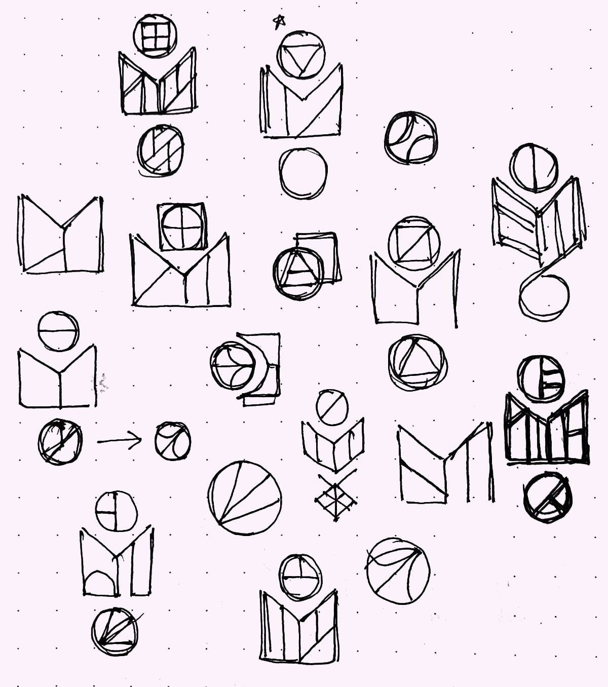
Different sketches taken from the exploration stage.
Consider starting with a sketchbook because it allows you to think less structurally and focus on the core idea. Once you find a sketch you prefer, take a picture or scan it into Adobe Illustrator.
02: Trace & Iterate
Using the sketch as a base, start tracing the shapes in Adobe Illustrator. I like to do this manually instead of using the auto-trace tool. Having a logo broken into small editable pieces lets you quickly iterate and explore different versions of the same idea.

Vectorized version of the logo sketch.
Once the sketch is traced, create different versions of the same logo. The first idea is usually not the best one. But even if you choose the first rendition, explore as much as possible to ensure it is the right one.
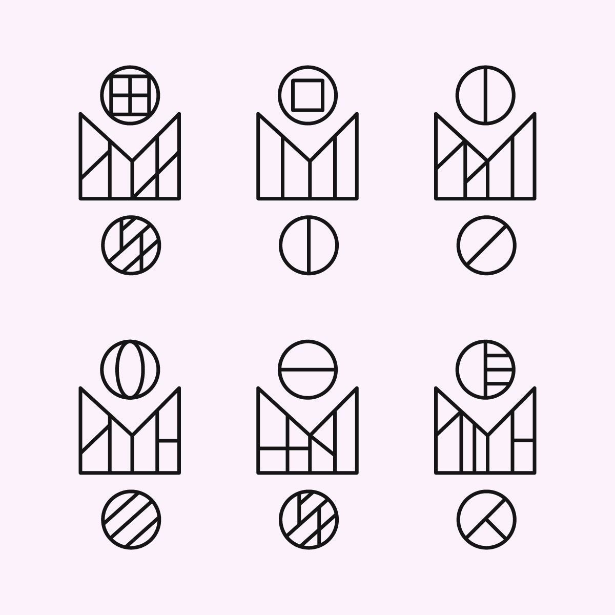
Different iterations of the same logo idea. The last one was my favorite.
The goal is to end up with one version you believe in. Now is the time to slowly refine the logo.
03: Measure & Grid
Refinement only starts after your mind is set on a logo. This step is all about noticing spacing patterns. Look for a consistent base unit repeated throughout the logo. Draw grid lines to find where it can be replicated.

The space between the vertical lines was repeated a few times. I made a great base unit.
Start drawing the grid once you clearly see repeated patterns. It quickly becomes apparent that the logo needs a few tweaks to align with the grid.
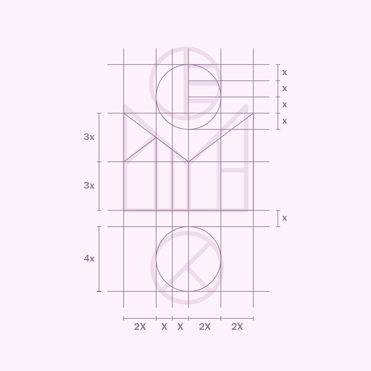
The grid shows a few places where the logo can be improved.
04: Redraw
Once the grid is ready, redraw the original logo to align it with the grid. Ensure the building blocks are easy to edit to save time if you need to make further changes.
It is important to constantly compare the refined logo to the traced version. Minor tweaks add up and can alter the essence of the original. Remember to trust your eye more than the grid. Spacing can feel and look wrong even when it is mathematically correct.
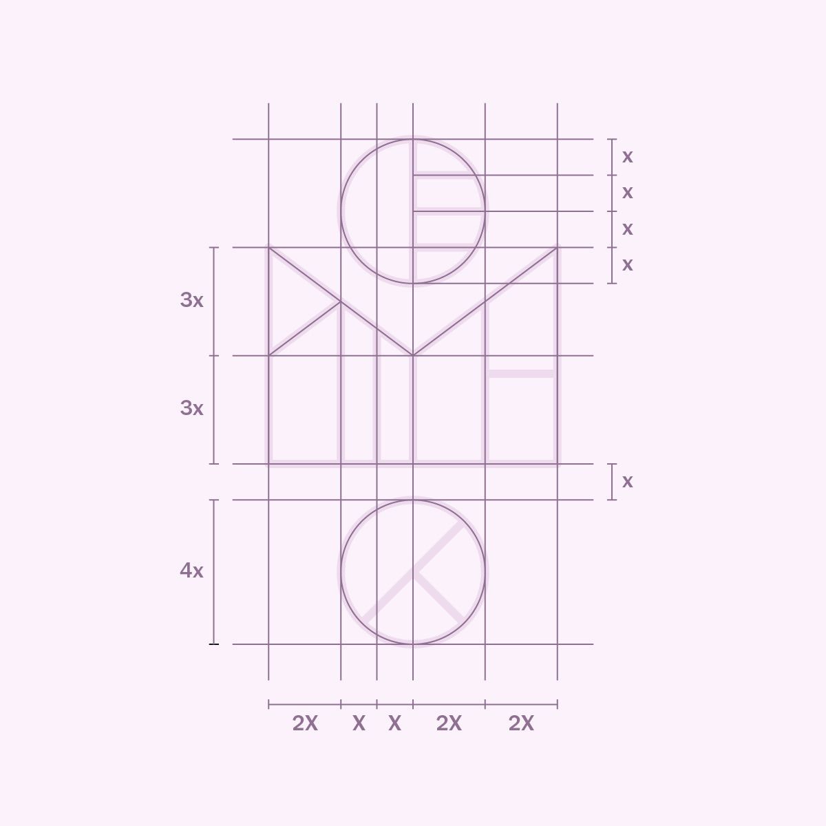
The refined logo now perfectly sits on the grid.
When in doubt, visually align elements. There’s always that one part that doesn’t look good when it follows the grid, and that’s okay.

Original traced logo on the left, refined version on the right.
You now have a slightly different version of the logo. One crafted with intentionality, care, and attention to detail. The logo is ready for export and to shine in the world.
