NOTE: This was originally posted for the V2 of my portfolio. We’re now in V3. Most references are no longer part of this website.
---
It has been a long time since I designed my first portfolio website. Back then, I had limited UI/UX knowledge and skills. Adobe Portfolio was the best way to get my work online. It allowed me to launch a portfolio in a short period but never to customize it to look how I wanted.
Four years of working almost exclusively on the web gave me enough experience to know what to include in a design portfolio. But even with all the experience, I still made mistakes and had to do a lot of backtracking. Mistakes are good because they teach you to plan better. These are some of the things I learned when redesigning my portfolio website.
Know Where You’re Going
Your web portfolio must highlight the kind of work you want to do in the future. Portfolios are good at realigning the direction of your career. No one will see you as a web designer if all projects in your portfolio are illustrations. And if you have different kinds of projects, you will be seen as a generalist.

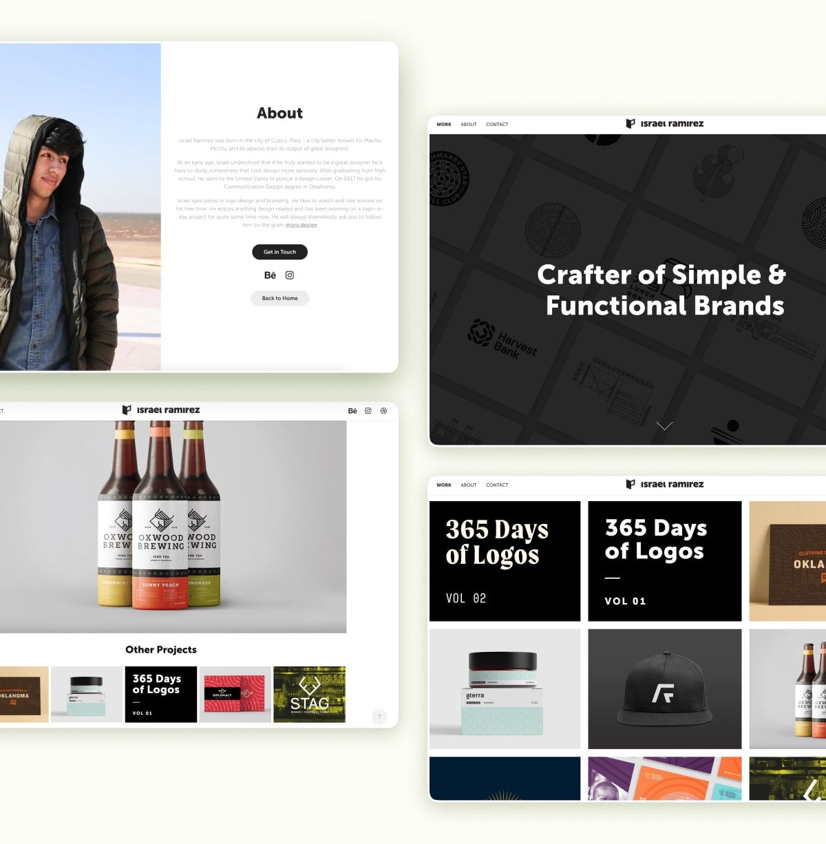
Screenshots from my previous portfolio website.
My previous portfolio site had a completely different focus when compared to the current one. When it first launched, my interest was in showing strong design foundations. All project pages were image-heavy, and the text was minimal. As I started working on the design of my new portfolio, I decided to:
- Focus on UI/UX by including web and digital products.
- Use Webflow to display my web developer skills.
- Add details reflective of me as a designer.
Good Content > Good Vibes
Web portfolios exist to enhance your work. Good art direction makes a website beautiful, but good content will always be more impactful. A detailed about page and well-structured projects can make or break a portfolio.
Beautiful aesthetics paired with weak content are like oatmeal served on a gold plate.
The best projects have the right balance between visuals and words. Projects relying on visuals alone miss the context that makes the design meaningful. And the ones filled with walls of text are tedious.
Your Website is a Reflection of You
Good portfolios have personality sprinkled throughout the site. Factors like the type choice, colors, photography, and language help your portfolio stand out. More importantly, they reflect your design philosophy. The home and about pages are the perfect places to show what makes you different.
I chose Saes Grotesk because of its rough look and quirky characters. I wanted to add contrast by pairing the imperfection of a grotesque typeface with a clean layout. My portfolio is embedded with sarcastic humor and reflects my relaxed personality.
Keep It Simple
At the end of the day, people come to see your work. Complex navigation and flashy effects make it harder to interact with content. There are countless things you can do on the web. But something being possible does not necessarily enhance the experience.
I planned to have cool transitions and unique interactions in my portfolio. But when I tested them, I realized that they only added noise. If I’m being honest, I still think there are a few interactions and animations that shouldn’t be on my portfolio website. I’m just too stubborn to take them out.
Details Matter
A pattern I’ve seen in my career is that excellent designers pay incredible attention to detail. Thoughtful interactions, animated icons, and good alignment enhance a website when used carefully. Intentionality is evident to the trained eye. Most people that go into your website might never notice hanging punctuation or other small details. But the ones who do will have an appreciation for it.
Keeping things simple and adding details might sound contradictory. This is where finding the right balance becomes key. If your portfolio is too simple, it risks being bland and unmemorable. Contrary, too many flashy effects, and hidden elements place content in the backseat.
I spent extra time adding small details throughout my website while ensuring I didn’t leave anything to chance. Click/tap my logo or go to the 404 page to see what I mean.
Pick the Right Platform
We live in a time where competition for portfolio builders is fierce. All platforms get the job done, but only a few will work for you. If you don’t want to spend a lot of time developing a website, Adobe Portfolio or a Squarespace template are great options. But if you need more control over your website, Webflow or Editor X can help you turn the design into reality. Truthfully, you don’t even need a website. A pdf portfolio or a Figma prototype can be equally or more impactful.
My pick was Webflow because of how easy it is to control the design of my website. Webflow is a visual coding platform that gives your control of every single detail. They make it easy to create an account, start designing, and pay for hosting when ready to launch. Webflow has a good collection of templates that speed up the entire process. But since I wanted to showcase my visual dev skills, I started from scratch.
It is All Part of the Process
My favorite thing about the web world is being able to constantly make changes and updates. Getting stuck with a specific look is almost impossible. A few clicks can swap fonts, update color codes, or tweak layouts. Imagine being stuck with a printed design and not being able to change anything about it even when it kills you inside.
I’m the kind of person that will find things I wish I had done differently only days after launching my website. I love that my portfolio can be periodically improved and pushed live instantly with minimal effort. You might be reading this journal entry on the third or fourth version of my portfolio.
TLDR
Your portfolio is the vehicle through which you share your work. All the considerations can be overwhelming, especially in the early stages. But in the end, only a handful of things matter. It took me over 3 months to finish mine because of a backward approach. I guess what I am trying to say is: don’t be like me. Feel free to reach out with questions, request future topics, or simply say hello.
